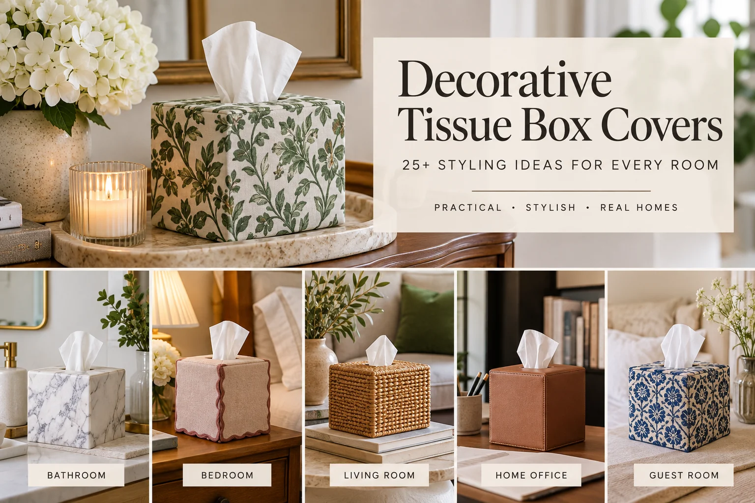

Decorative tissue box covers work best when they solve two problems at once: they hide the printed cardboard box and help the tissue box belong to the room instead of looking like an afterthought. The most successful ones are not simply “pretty.” They have the right scale, material, color, finish, and visual weight for the surface they sit on.
This guide goes beyond a list of cute covers. It shows how to choose and style a tissue box cover in a bathroom, bedroom, living room, entryway, guest room, and home office, with practical rules for trays, lamps, books, mirrors, counters, and other nearby objects.
If you are still deciding what kind of holder you need, start with our complete tissue box cover guide. If proportions are the problem, the square vs. rectangular tissue box cover guide explains how footprint and height affect placement.
Start With the Surface, Not the Tissue Box
The easiest way to make a decorative tissue box cover look intentional is to design around the furniture or counter it sits on. A cover that works on a long console table may feel oversized on a nightstand, while a tiny cube cover can disappear on a broad bathroom vanity.
| Surface | Best visual approach | Common mistake |
|---|---|---|
| Small nightstand | Low-contrast color, compact footprint, simple material | Using a tall or ornate cover that competes with the lamp |
| Bathroom vanity | Wipeable finish, calm palette, enough weight to stay put | Choosing absorbent or hard-to-clean materials beside water |
| Long console table | Statement material or sculptural shape, grouped with larger objects | Leaving the cover isolated in the middle of a wide surface |
| Desk | Clean shape, restrained finish, practical footprint | Using novelty decor that adds visual clutter near work items |
| Guest-room dresser | Soft neutral, fabric, ceramic, leather, or wood | Matching every object too literally |
Blend In or Stand Out? Decide This First
Most styling problems become easier once you decide whether the tissue box should visually disappear or become an accent. If a bedside table already holds a lamp, books, glasses, and charging devices, the tissue cover should usually recede. On a sparse console or guest-room dresser, a patterned ceramic, sculptural resin, lacquered color, bold textile, or unusual woven piece can contribute to the composition.
A useful rule is to repeat one characteristic, not the whole object. Repeat the brass finish of a lamp, the olive color of a cushion, the warm grain of a frame, or the black line of a mirror. Exact matching usually looks more staged than coordinated.
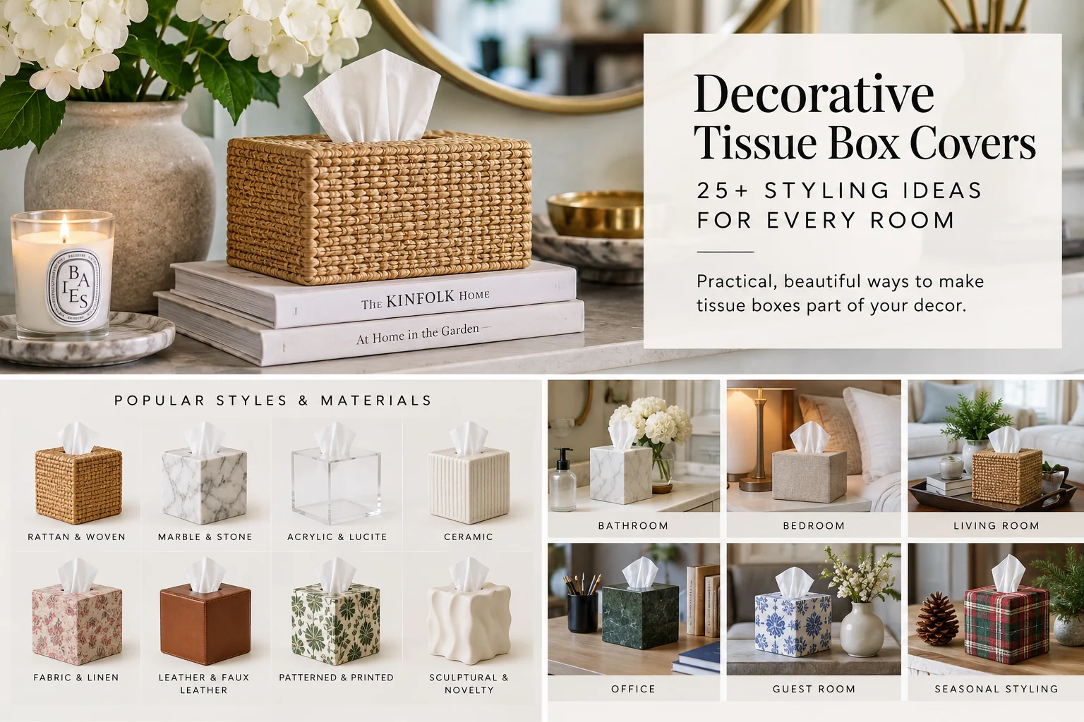
Bathroom: Style for Water, Reflection, and Counter Clutter
Bathroom styling is less forgiving than bedroom styling because mirrors multiply visual clutter and counters collect small objects quickly. A tissue cover should simplify the surface rather than add another busy element.
1. Match the countertop undertone, not just the cabinet color
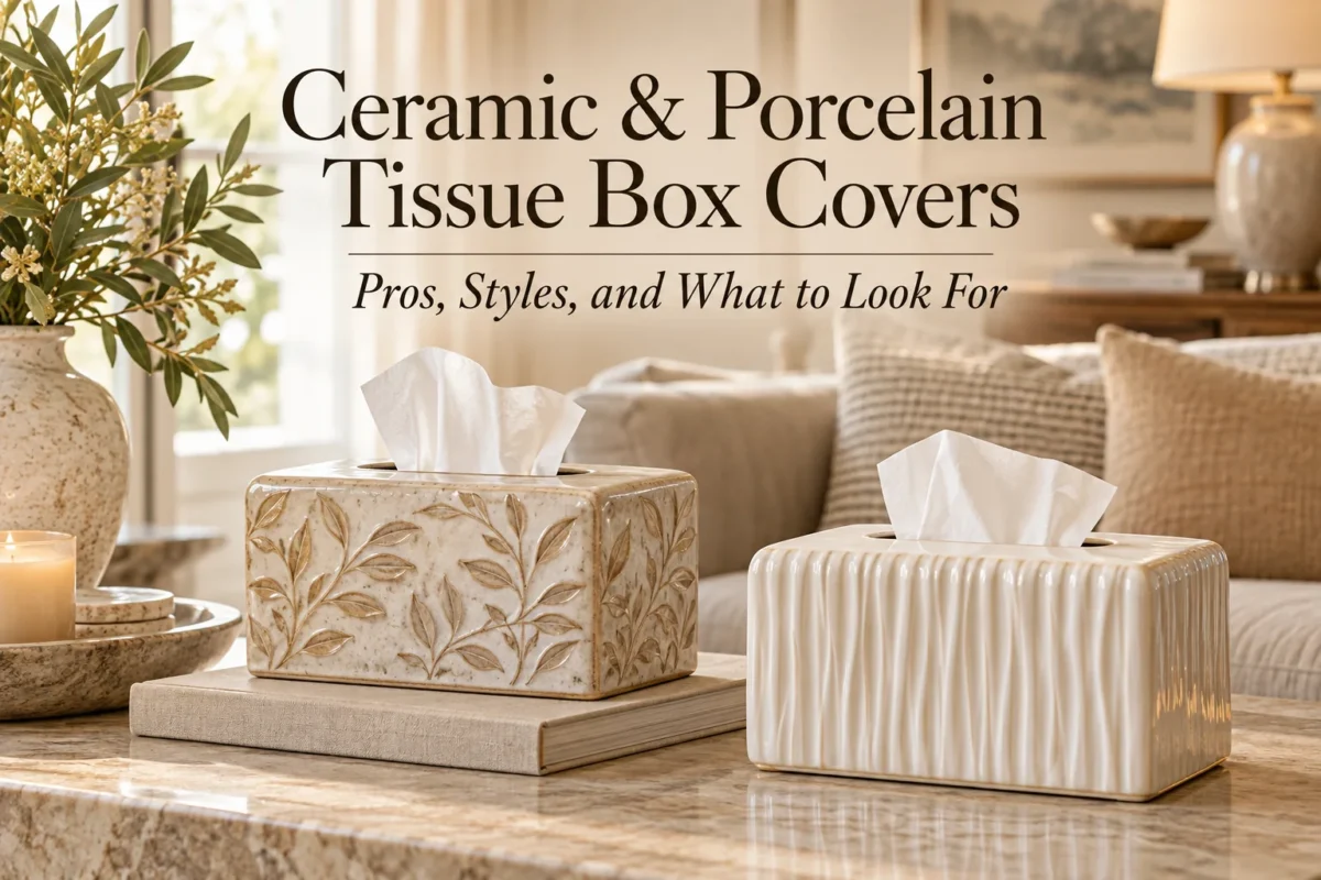
On warm marble, travertine, cream quartz, or beige stone, off-white ceramic, warm wood, tan leather, and natural fibers tend to look more settled than icy white or chrome. On cool gray stone, white porcelain, smoked acrylic, brushed metal, or pale gray finishes usually connect better.
2. Use woven texture carefully
Rattan, seagrass, and wicker can soften a hard bathroom full of tile, mirrors, and stone. They work best on a dry vanity or shelf away from direct splashes. If the counter gets wet often, choose a synthetic woven cover or place the natural-fiber version on a tray.
3. Keep a spa palette restrained
Instead of adding literal “spa” symbols, build the feeling with muted white, eucalyptus green, stone, pale oak, frosted glass, or soft gray. A tissue cover in the same family as folded towels and soap dispensers creates a calmer result than a themed object.
4. Use one tray to contain small bathroom objects
If the tissue box shares the vanity with perfume, cotton pads, hand cream, or soap, a shallow tray can visually connect the items. Do not crowd everything into one tray. Leave enough visible surface for each object to read separately.
For a deeper material comparison, see our guide to ceramic and porcelain tissue box covers and our fabric vs. hard-material comparison.
Bedroom: Keep the Tissue Box Quieter Than the Bed
In a bedroom, bedding, the headboard, and lighting should usually carry more visual weight than the tissue box. Decorative covers work best when they support those elements instead of competing with them.
5. Echo one bedding color
Pull a minor color from a patterned duvet, throw pillow, or blanket and repeat it in the cover. If the bedding is mostly neutral, use a tonal cover rather than introducing a random new accent color.
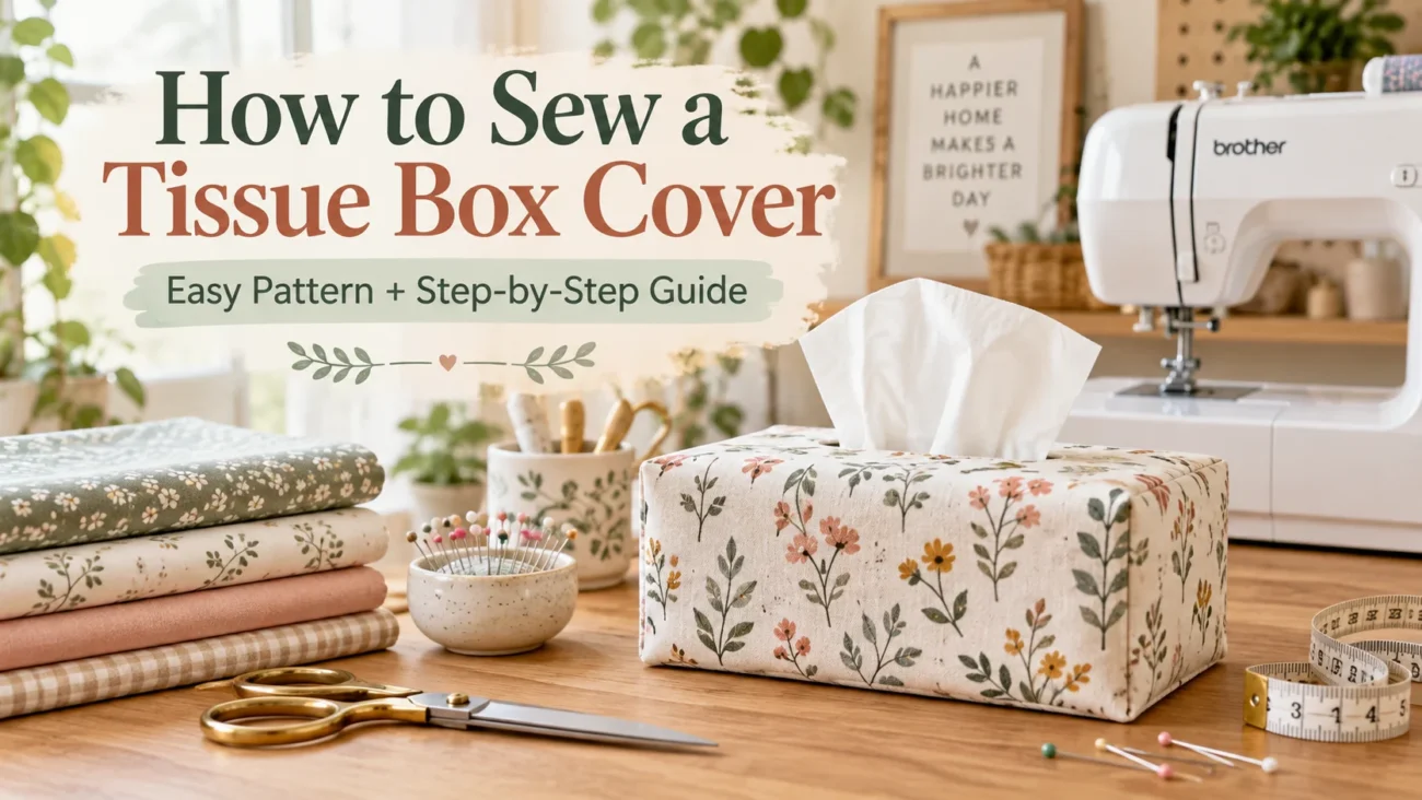
6. Use fabric when you want softness
A fabric cover works especially well near upholstered headboards and layered bedding because it repeats softness. Choose a structured cover rather than a floppy sleeve if you want a tailored result. Linen blends, quilted cotton, small-scale florals, ticking stripes, and soft solids are easier to integrate than very large prints.
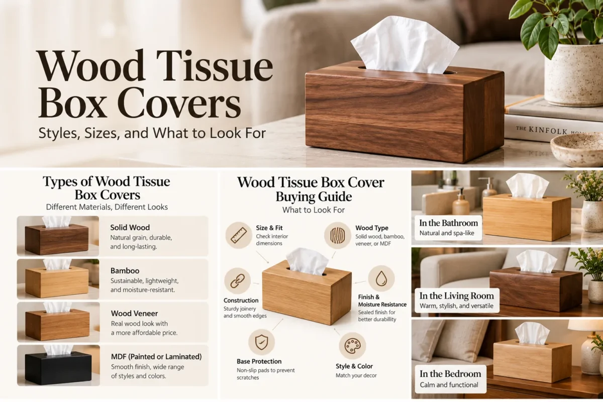
7. Use wood to bridge mismatched furniture finishes
If the nightstand, bed frame, and dresser are not the same wood, avoid trying to match the tissue cover exactly. Choose a medium wood tone that sits between the darkest and lightest finishes in the room so it reads as a bridge rather than a failed match.
8. Leave breathing room around the lamp
On a small bedside table, the tissue box should not touch the lamp base. Even a few inches of visible surface between objects can make a cramped arrangement look deliberate. If that spacing is impossible, use a smaller cube box or move tissues to a dresser or shelf.
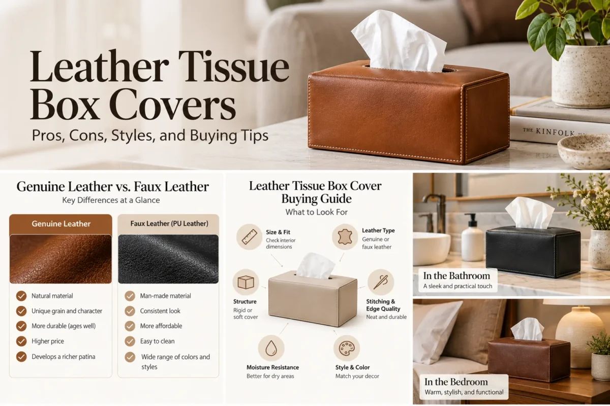
Leather can also work well in a bedroom when you want a more tailored look; our leather tissue box cover guide explains what to check before buying.
Living Room and Console Table: Style in Groups, Not Isolation
A tissue box alone in the middle of a console usually looks accidental. The goal is to connect it to a larger composition while keeping enough empty surface around the arrangement.
9. Build a three-height arrangement
Pair the tissue cover with one taller object and one lower object. For example: lamp + tissue cover + stacked books, vase + tissue cover + bowl, or artwork + tissue cover + tray. Different heights create visual rhythm and prevent the cover from looking like a random block.
10. Use books to correct scale
If a tissue cover feels too small for a large console, place it beside or partially in front of a short stack of books. If it already feels tall, keep it on the table surface. Books are useful because they let you alter the apparent scale of nearby accessories without buying new pieces.
11. Let sculptural covers act as decor
Book-shaped, architectural, carved, pleated, animal-inspired, or abstract covers can work on a console where there is enough space to appreciate the shape. Treat them like sculpture: give them empty space and reduce competing novelty pieces nearby.
12. Use a tray when the console doubles as a drop zone
If keys, sunglasses, mail, or remotes accumulate on the console, a tray gives the tissue box a defined territory. Keep loose everyday items in a separate bowl or catchall so tissues do not become visually mixed with clutter.
Home Office: Make the Cover Part of the Desk System
A desk usually benefits from less decoration, not more. The best office tissue cover feels related to organizers, monitor stands, lamps, or stationery and does not steal attention from the work area.
13. Repeat the desk’s dominant material
On a walnut desk, a walnut-toned wood or brown leather cover looks integrated. On a white lacquer desk with metal hardware, clear acrylic, black leather, brushed metal, or white ceramic can feel more coherent.
14. Keep novelty away from focus zones
Novelty covers can be fun, but the area immediately around the monitor and keyboard is usually the wrong place for them. Put a more expressive cover on a side credenza, shelf, or secondary desk surface instead.
15. Use integrated storage only when it solves a real problem
Tissue holders with pen cups, phone slots, or small compartments can save space, but they become clutter magnets if every compartment fills with miscellaneous objects. Choose one only if the storage replaces another organizer already on the desk.
Guest Room: Make the Tissue Box Easy to Find and Easy to Use
Guest rooms benefit from simple, readable styling. Visitors should be able to find tissues immediately without decoding decorative clutter.
16. Put tissues where a guest naturally reaches
The best locations are a nightstand, dresser corner, or bathroom vanity. Avoid hiding the box inside a decorative basket unless the opening is obvious.
17. Choose a low-maintenance material
Ceramic, wood, leather-look finishes, and structured fabric are good guest-room choices because they look considered without demanding frequent rearranging. Avoid delicate embellishments that snag or collect dust.
18. Pair the cover with one hospitality cue
A tissue cover beside a small carafe, hand cream, reading material, or a simple tray can make the room feel prepared for a guest. Keep the setup sparse enough that the surface still feels usable.
How to Choose a Decorative Pattern Without Creating Visual Noise
Patterned tissue covers are easy to overdo because the object is small but visually dense. Pattern scale matters.
- Small floral or geometric print: works well on compact bedside tables and bathroom counters.
- Large botanical or abstract motif: better on open consoles or dressers where the full pattern can be seen.
- Stripe: useful for reinforcing a tailored or coastal look; align stripes carefully on fabric covers.
- Plaid or check: adds structure and traditional character but can clash with patterned bedding.
- Animal print or novelty pattern: works best as the only high-energy pattern in that small area.
When two patterns sit near each other, vary the scale. A small-check tissue cover beside large floral curtains is easier on the eye than two equally dense prints.
Color Matching: Use Relationships, Not Exact Matches
- Tonal: light beige cover on a medium beige vanity.
- Analogous: olive cover near green-gray walls and warm wood.
- Accent repeat: rust cover echoing one rust pillow across the room.
- High contrast: black cover on pale stone when black is repeated in hardware or lighting.
- Material contrast: natural rattan on a glossy white surface to add warmth without adding color.
If the cover introduces a completely new color, repeat that color once elsewhere nearby—even in a book spine, flower, candle, or artwork detail. That small repetition is often enough to make the choice look intentional.
Seasonal Styling Without Re-Decorating the Whole Room
- Spring: washed linen, pale floral, soft green, light ceramic.
- Summer: rattan, seagrass, striped fabric, pale blue, clear acrylic.
- Autumn: walnut, tan leather, rust textile, amber acrylic, warm ceramic glaze.
- Winter: dark wood, velvet, deep green, burgundy, matte black, metallic accents.
The easiest seasonal strategy is to change texture or one accent color while keeping the rest of the room intact. Avoid overt holiday motifs unless you genuinely enjoy storing and rotating themed decor.
Unique and Novelty Tissue Box Covers: When They Work
Book stacks, sculptural faces, houses, animals, folded forms, architectural shapes, and art-print covers work best when three conditions are true: the surrounding surface is not already crowded, the design relates to the room through color or material, and the shape does not make refilling or tissue pulling frustrating.
A whimsical cover can be especially effective in a powder room, child’s room, reading nook, or eclectic living room. In a minimalist room, one sculptural cover can also work—but only if it replaces other decorative objects instead of joining a collection of them.
How to Style a Tissue Box on a Tray
- Choose a tray at least a little wider than the tissue cover in one direction.
- Place the tissue cover slightly off-center instead of perfectly centered.
- Add one taller object, such as a vase, bottle, or candle.
- Add one low object, such as a dish or small box.
- Leave visible tray surface between items.
- Make sure tissues can still be pulled without knocking anything over.
If the tray is only large enough for the tissue box itself, it is functioning more like a protective mat than a styling tool. That can still be useful, but it will not create the same grouped composition.
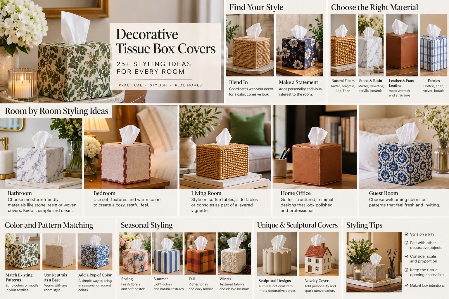
25+ Practical Styling Ideas at a Glance
- Use woven texture to soften a hard bathroom.
- Match ceramic to countertop undertones.
- Use frosted acrylic on a visually busy vanity.
- Place the cover on a tray with one tall and one low item.
- Repeat a towel color in the cover.
- Choose fabric that echoes bedding without matching it exactly.
- Use wood as a bridge between mixed furniture finishes.
- Keep a compact cube cover beside a small bedside lamp.
- Use leather on a desk with warm wood.
- Choose clear acrylic for a visually crowded workspace.
- Use a sculptural cover on an otherwise sparse console.
- Pair a cover with stacked books to balance scale.
- Repeat a metal finish from nearby lighting or hardware.
- Use one bold cover instead of several novelty objects.
- Choose a small pattern for a small surface.
- Use a large motif only where it can be seen fully.
- Repeat a new accent color once nearby.
- Use black only when another black element anchors the room.
- Swap texture seasonally instead of redecorating the whole space.
- Use washable or wipeable materials in high-use rooms.
- Choose a low-maintenance cover for guest rooms.
- Leave negative space around the tissue box on a console.
- Use a wall-mounted holder when the counter itself is the problem.
- Use integrated storage only when it replaces another organizer.
- Move tissues off the main surface if the furniture is too small.
- Use a statement cover in a powder room for low-risk personality.
- Coordinate the cover with art through one repeated color.
- Use natural texture to warm a modern white room.
- Keep the cover simpler than the room’s main focal point.
Common Styling Mistakes
- Matching everything exactly: repeating one or two details usually looks more natural than buying a complete matching set.
- Choosing style before scale: a beautiful cover still looks wrong if it overwhelms the nightstand or disappears on a huge console.
- Ignoring the actual tissue-box size: measure your usual refill and compare it with the holder’s interior dimensions.
- Using too many small objects together: tissue cover + candle + bowl + perfume + tiny vase can quickly read as clutter.
- Prioritizing novelty over usability: if the opening snags tissues or the cover is difficult to refill, the styling becomes annoying in daily use.
A 60-Second Styling Check
- Scale: Does the cover fit the furniture surface without crowding it?
- Relationship: Does it repeat at least one color, finish, material, or shape already in the room?
- Contrast: Is it intentionally blending in or intentionally standing out?
- Function: Can tissues be pulled easily and the box refilled quickly?
- Maintenance: Is the material realistic for dust, water, fingerprints, or cleaning in that room?
- Negative space: Is there enough empty surface around it for the arrangement to breathe?
Frequently Asked Questions
Should a tissue box cover match the room?
It should relate to the room, but it does not need to match exactly. Repeating one element—such as a wood tone, metal finish, accent color, or texture—is usually enough.
What color tissue box cover is easiest to style?
Warm white, taupe, black, medium wood, clear acrylic, and natural woven tones are among the easiest because they work with many palettes. The best choice still depends on the surrounding surface and lighting.
Are decorative tissue box covers outdated?
Not inherently. Highly themed or ornate styles can date quickly, but simple ceramic, wood, leather, woven, fabric, and acrylic covers function much like other small home accessories.
Should I put a tissue box on a tray?
A tray is useful when it groups the tissue box with two or three related items or protects the surface underneath. Skip it if the tray makes the arrangement cramped.
How do I make a tissue box look good on a nightstand?
Keep the cover compact, use a calm color or material, leave space around the lamp, and avoid adding too many small decorative objects. The bed and lamp should remain the main visual elements.
Bottom Line
The best decorative tissue box covers do not call attention to the fact that they are hiding cardboard. They simply look like they belong with the furniture, materials, colors, and objects already in the room.
Choose by surface first, then material, then color and finish. Decide whether the cover should blend in or become an accent, and give it enough space to function. That approach is more reliable than buying a decorative cover in isolation and trying to force it into the room afterward.